Slack-style search on Flutter Web
Get Slack-style desktop search modals on Flutter web with the PaginatedSearchBar library.

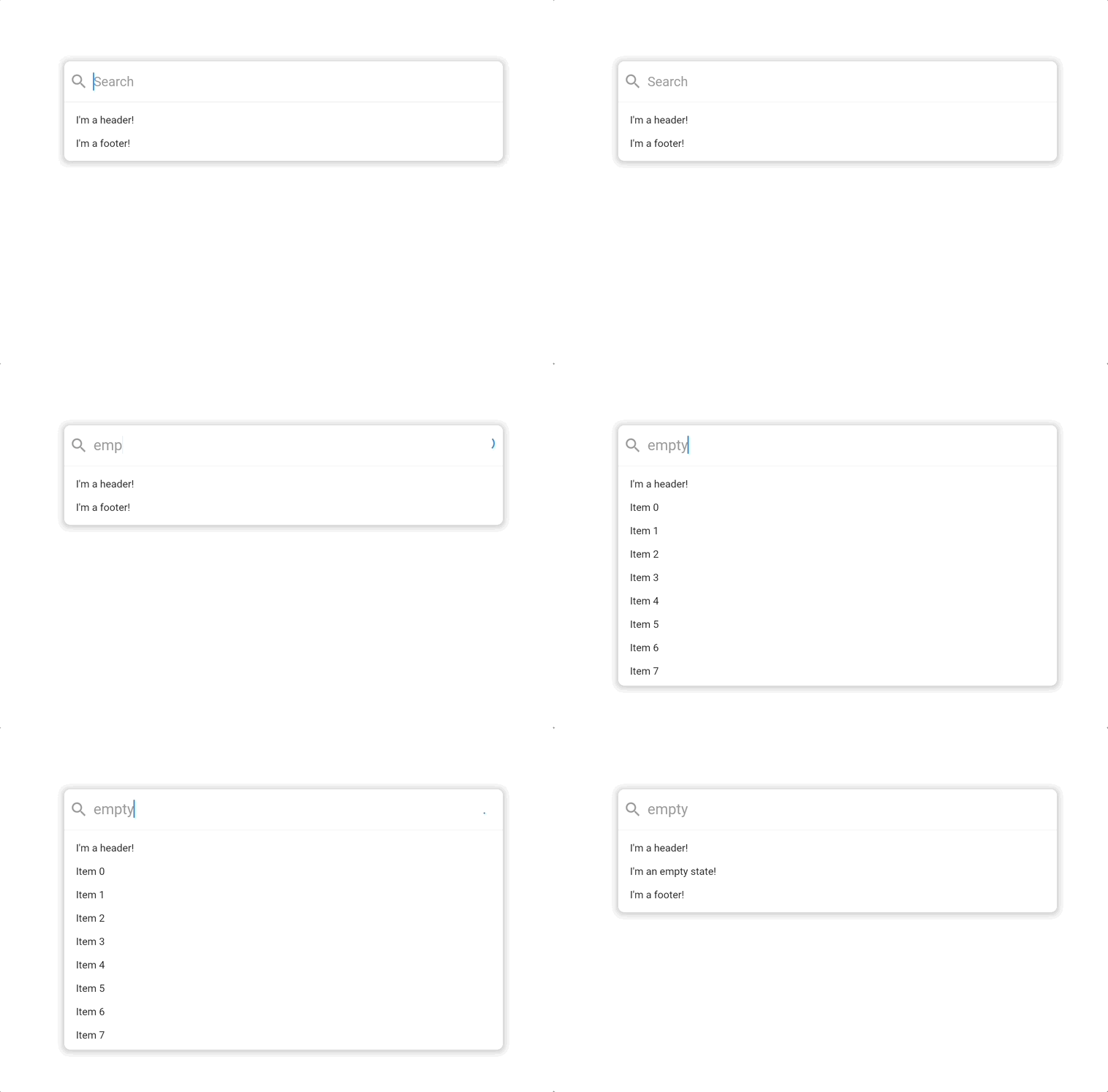
By combining some of the libraries we’ve discussed in the past like Modal Stack Router for building modal flows on Flutter web and Endless for building infinite lists, we can build a Slack-style modal search bar that looks like this:

This widget is called PaginatedSearchBar and it supports extensive customization with custom styling, headers, placeholders, footers and more. Let’s look at a coding example:
class ExampleItem {
  final String title;

  ExampleItem({
    required this.title,
  });
}

PaginatedSearchBar<ExampleItem>(
  onSearch: ({
    required pageIndex,
    required pageSize,
    required searchQuery,
  }) async {
    // Call your search API to return a list of items
    return [
      ExampleItem(title: 'Item 0'),
      ExampleItem(title: 'Item 1'),
    ];
  },
  itemBuilder: (
    context, {
    required item,
    required index,
  }) {
    return Text(item.title);
  },
);
In this basic usage, you only need to specify two options to get started. An onSearch function for fetching data and an itemBuilder for how it should be displayed in the search results list. If you need more functionality than that, like header and footer sections, you can pass some additional builders:
PaginatedSearchBar<ExampleItem>(
  maxHeight: 300,
  hintText: 'Search',
  headerBuilder: (context) {
    return const Text("I'm a header!");
  },
  headerBuilder: (context) {
    return const Text("I'm a footer!");
  },
  emptyBuilder: (context) {
    return const Text("I'm an empty state!");
  },
  onSearch: ({
    required pageIndex,
    required pageSize,
    required searchQuery,
  }) async {
    return [
      ExampleItem(title: 'Item 0'),
      ExampleItem(title: 'Item 1'),
    ];
  },
  itemBuilder: (
    context, {
    required item,
    required index,
  }) {
    return Text(item.title);
  },
);

State Properties
In the previous example, our search results list had a fixed header. What if we only wanted to show a header when the list is empty? PaginatedSearchBar builders use the StateProperty pattern found in Flutter Material’s core widgets such as TextButton to support greater customization.
The Material UI libray uses this pattern to let consumers of core widgets like TextButton style it differently when it is in one more states like hover or pressed. The basic example from the docs looks like this:
TextButton(
  style: ButtonStyle(
    // Use the color green as the background color for all button states.
    backgroundColor: MaterialStateProperty.all<Color>(Colors.green),
  ),
);

TextButton(
  style: ButtonStyle(
    backgroundColor: MaterialStateProperty.resolveWith<Color>(
      // The state property passes all the current states the button is in
      // so that the button style can be customized.
      (Set<MaterialState> states) {
        // Lighten the button color when it is in the pressed state.
        if (states.contains(MaterialState.pressed))
          return Theme.of(context).colorScheme.primary.withOpacity(0.5);
        return null;
      },
    ),
  ),
);
We use this same pattern to support customizing the search bar based on its current states. The possible states are defined below:
enum PaginatedSearchBarState {
  /// Present when the search bar is searching for items. Triggered when they update their search
  /// query in the input.
  searching,

  /// Present when the search bar is fetching a page of items either as a result of a modified search query
  /// or by scrolling to the bottom of the list view and triggering the next page load.
  loading,

  /// Present when the search bar has no matching items for the current search query.
  empty,

  /// Present when the search bar has no more items to fetch for the current search query. Triggered
  /// when the [PaginatedSearchBar.onSearch] function returns fewer than [PaginatedSearchBar.pageLimit]
  /// items or [EndlessPaginationDelegate.maxPage] has been reached and no more items can be fetched.
  done,

  /// Present the input is currently focused.
  focused,
}
In order to only show a header when the list is empty, we can use the headerBuilderState state property:
PaginatedSearchBar<ExampleItem>(
  maxHeight: 300,
  hintText: 'Search',
  headerBuilderState: PaginatedSearchBarBuilderStateProperty.empty((context) {
    return const Text("I'm a header that only shows when the results are empty!");
  }),
  emptyBuilder: (context) {
    return const Text("I'm an empty state!");
  },
  onSearch: ({
    required pageIndex,
    required pageSize,
    required searchQuery,
  }) async {
    return [
      ExampleItem(title: 'Item 0'),
      ExampleItem(title: 'Item 1'),
    ];
  },
  itemBuilder: (
    context, {
    required item,
    required index,
  }) {
    return Text(item.title);
  },
);
Custom Styling
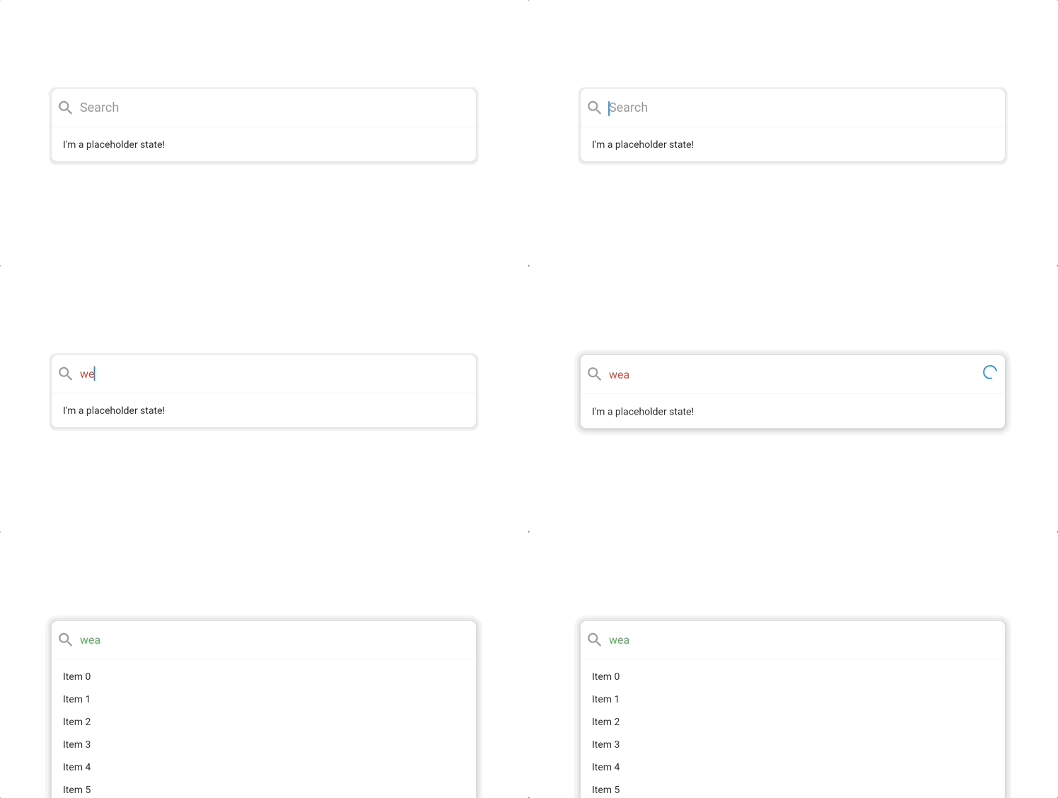
We can use the same state property pattern to support custom styling. Here’s a search bar that changes its text color from red to green when it has data:
PaginatedSearchBar<ExampleItem>(
  maxHeight: 300,
  hintText: 'Search',
  inputStyleState:
      PaginatedSearchBarStyleStateProperty.resolveWith((states) {
    if (states.contains(PaginatedSearchBarState.empty)) {
      return TextStyle(color: Colors.red);
    }
    return TextStyle(color: Colors.green);
  }),
  placeholderBuilder: (context) {
    return const Text("I'm a placeholder state!");
  },
  onSearch: ({
    required pageIndex,
    required pageSize,
    required searchQuery,
  }) async {
    return [
      ExampleItem(title: 'Item 0'),
      ExampleItem(title: 'Item 1'),
    ];
  },
  itemBuilder: (
    context, {
    required item,
    required index,
  }) {
    return Text(item.title);
  },
);

How it works
Under the hood, the PaginatedSearchBar widget is basically just the following:
Column(
  children: [
    // Our search input
    TextFormField(...),
    AnimatedSize(
      child: EndlessPaginationListView(...),
    ),
  ]
);
The composability of Flutter widgets make it relatively straightforward to take our existing tools like our infinite list view and combine them with widgets like text fields to create helpful new elements like search bars. If you have feedback on features that would make PaginatedSearchBar more useful in your own applications then feel free to let us know at the project GitHub. Happy coding!